assumes new form, reach new heights
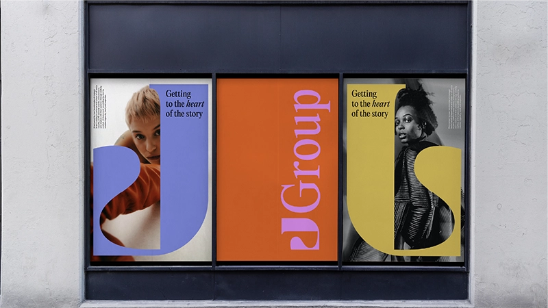
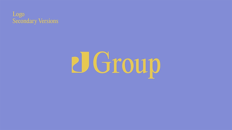
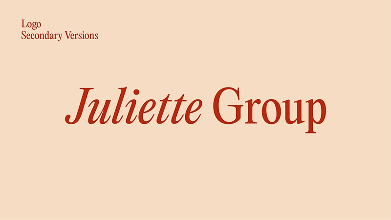
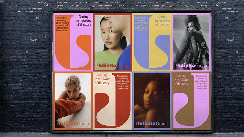
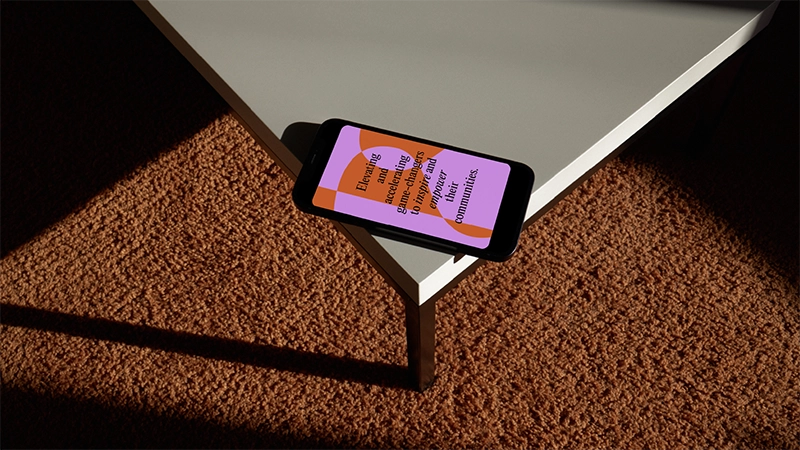
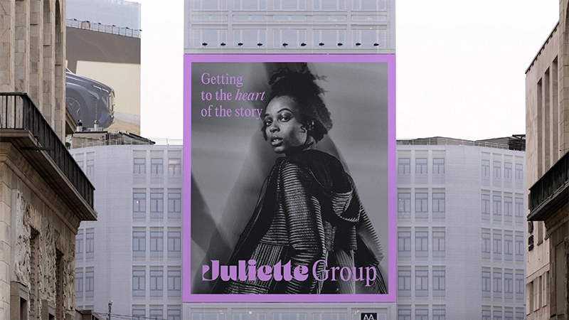
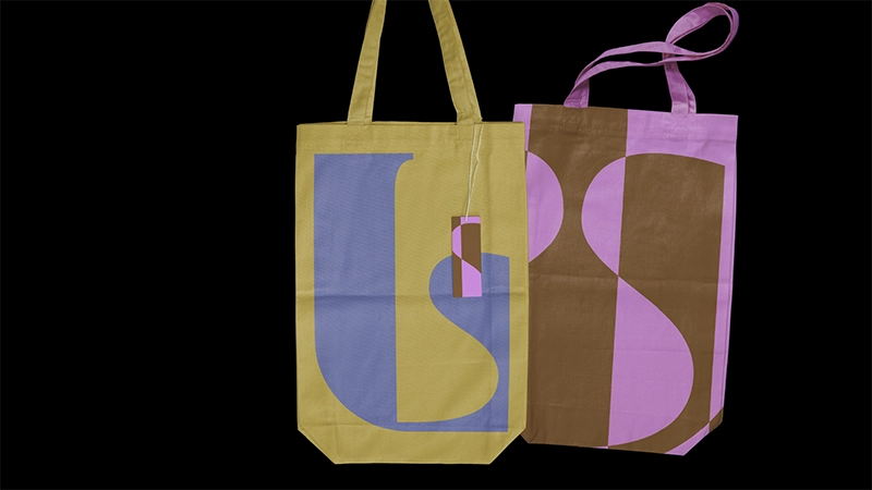
We set out to capture the duality at the heart of JGroup's work: the polish of legacy media and the pulse of what’s next. The result is a visual identity that’s both cosmic and classic. The typefaces used are referential to classic editorial type, with serif forms that harken the agency’s deep roots in print journalism and its mastery of traditional earned media. But the logo's shapes are softened with midcentury curves reminiscent of 1970s space-age retrofuturism. This design era embodied wide-eyed optimism and ambitious technological innovation, quite literally reaching for the stars. That ethos and its aesthetics felt deeply aligned with JGroup's evolution: an agency grounded in the rigor of traditional PR, now expanding its orbit to include social strategy, influencer relations, and cultural storytelling.
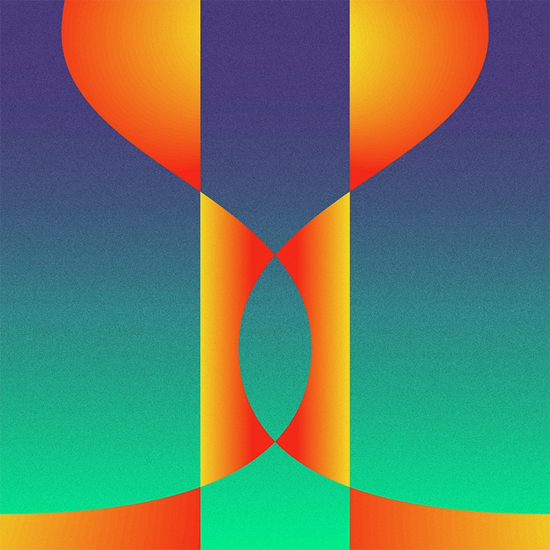
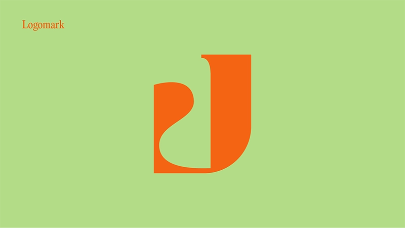
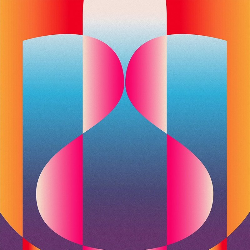
The logomark borrows from spaceship-like forms—symbolic of both connectivity and propulsion— both necessary components of great Public Relations strategies. We selected a vibrant, sun-saturated color palette to reflect the agency’s entrepreneurial energy. These elements work together to express a bold new chapter for the brand of expansion, growth, and innovation for the agency.